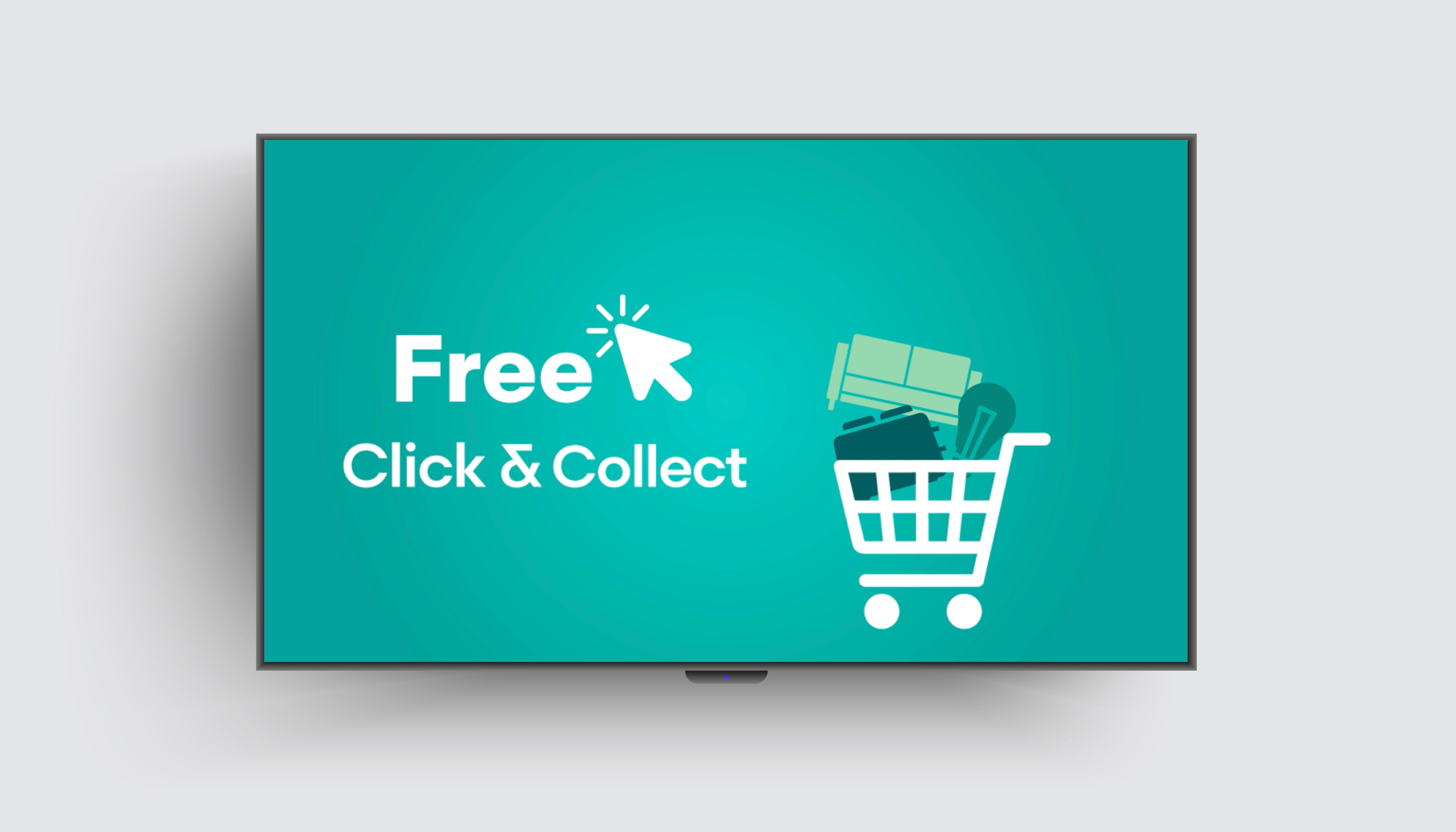
Robert Dyas opened its Bracknell branch in late 2023, marking the first store to launch with a completely refreshed brand look and feel, an initiative that began in 2022.This store was the first Robert Dyas location to feature five TV screens.
While most of the videos played were campaign-driven, I had the opportunity to create an evergreen motion piece highlighting the in-store services. This became the first brand-led video in the store, perfectly aligned with the new brand signage and the store’s updated, fresher appearance.
Date:
August 2023
Role:
Motion Design
Company:
Robert Dyas
Industry:
Retail

_Challenge
Robert Dyas stores can feel visually overwhelming due to overstocked displays. The challenge was to create content for the screens that provided a calm, engaging experience while reinforcing the updated brand identity.
_Strategy
The video was created using icons and other assets saved as .png or .ai files, then animated with Adobe After Effects. Icons are key elements in the Robert Dyas brand identity, as they form the primary logo. To illustrate products in the video, I used the same icons found in the logo whenever possible, or created new ones in the same style.
For example, in the second scene, we inform customers about our website, where they can purchase products not stocked in-store. The website is ideal for buying bulky items that are difficult to carry home from our high street shops. Therefore, I chose bulkier products like a BBQ, furniture, and a shed. Even though sheds are not in our logo, they are popular on our website, so I created an icon to include in this section.In other scenes, smaller products are illustrated, such as in the trolley scene and the shipping box for the DHL service. Here, I selected products we frequently sell and are known for, such as small appliances and lightbulbs.
The colour palette is based on Robert Dyas' primary and secondary colours. Initially, I considered using only the core colours, blue and green, but the result appeared too dark. Incorporating turquoise and mint from the secondary palette allowed for a brighter composition and maximised the RGB brightness of the screen. The main hues revolve around turquoise and blue, with warmer accents in the second part of the video to tie together the Robert Dyas brand with partner logos.
_Results
The video seamlessly blended with the updated store design, creating a calm and engaging customer experience. Its clear, approachable messaging reinforced the brand identity and set a creative benchmark for future in-store content.


