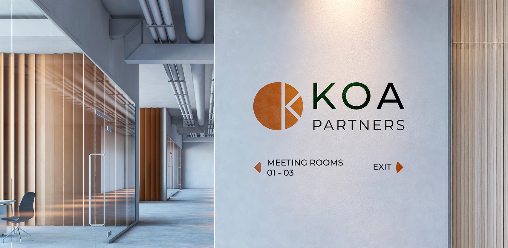
KOA Partners
Visual Identity
KOA Partners is a consulting firm based in Italy, specialised in helping companies improve their efficiency. KOA Partners needed a logo to represent the firm in a clean and modern way on both corporate stationery and online.
Date:
December 2023
Type of project:
Freelance Project
Client:
KOA Partners
Industry:
Services
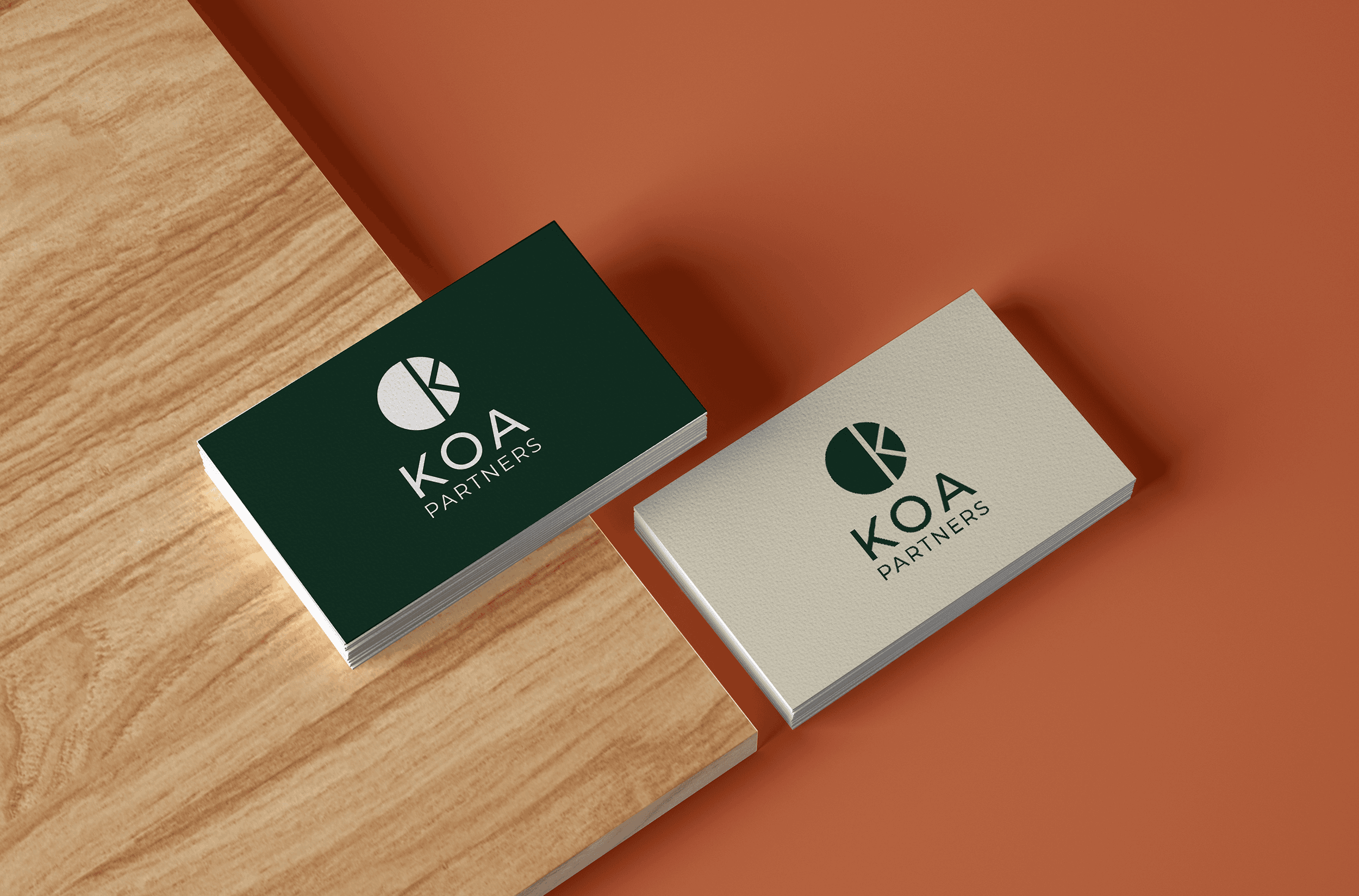
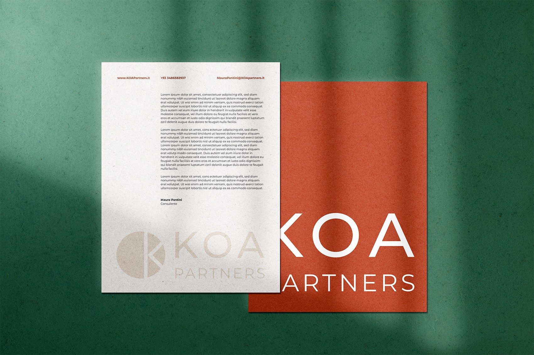
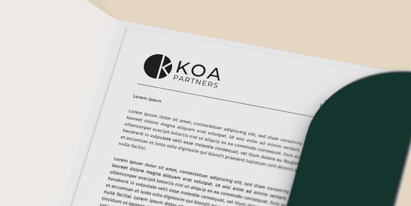
The chosen logo is simple and modern. The circular logomark comes from a filled letter O, cleverly shaped into a K by subtraction. It sits alongside the KOA Partners logotype, set in a clean sans-serif font with light tracking for a refined look.
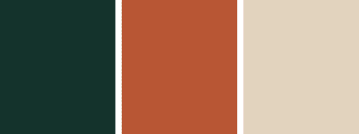
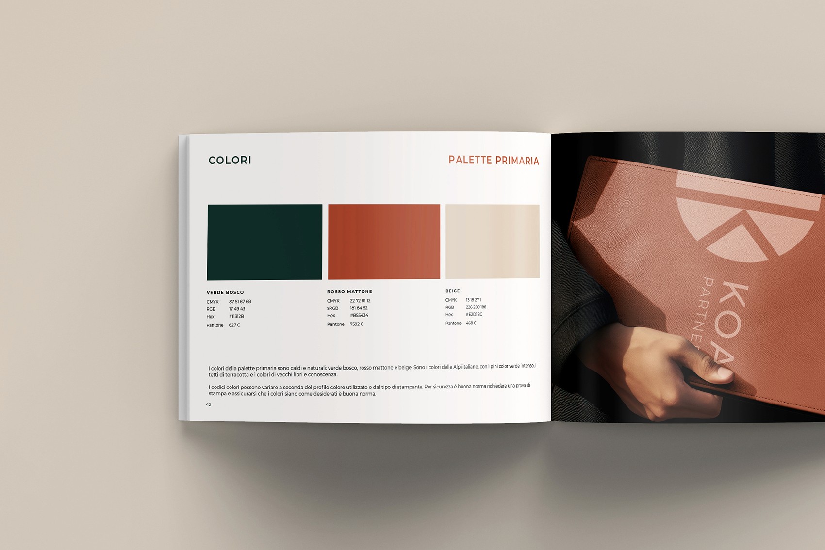
KOA Partners wanted a visual identity that reflected their roots and values. I guided them through selecting a warm, inviting colour palette inspired by the Italian Alps where they are based. The deep pine green symbolises the towering trees, burnt orange recalls terracotta rooftops, and soft beige evokes the charm of old books and timeless knowledge. This thoughtful combination brings their brand story to life in a way that feels authentic and enduring.


